As far as the world of Science is concerned, the colour pink does not exist. It is an extra-spectral colour, which means it cannot exist without a little rainbow-bending from a number of different colours – red, violet and even a little blue. We may think we see pink, but in fact we are not seeing actual wavelengths of pink light. But for a colour that doesn’t really exist, Pink has made a significant splash, shifting from one extreme to the other over the last three centuries.
The word itself did not even enter the English language as a noun until the 17th Century. Named after the flowers, it nevertheless references their frilled edges rather than the colour of the petals, alluding to the verb, ‘to pink’, as in the action of trimming fabrics with zigzags to prevent them from fraying. In Europe, its pastel shades were long considered a statement of soft, girlish femininity and hope. And yet, in contemporary Japanese culture pink is perceived as a masculine and mournful colour that represents young warriors who fall in battle, while in the full bloom of life.
The Third Reich used an inverted pink triangle to identify anyone suspected of homosexuality, a badge which was later positively reclaimed by the LGBTQ+ pride movement. In Korea it represents trust but in India, it connotes hospitality. By the late 1970’s a shade called Baker-Miller Pink was tested in British prisons and found to reduce incidents of aggressive behaviour. And now? Pink is less a colour than an attitude, a pale, “post-gender” centre of every millennial mood-board.
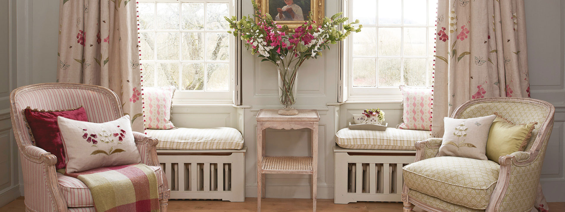
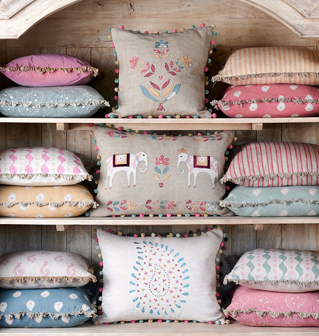
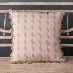
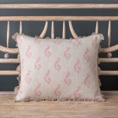
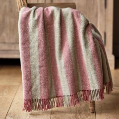
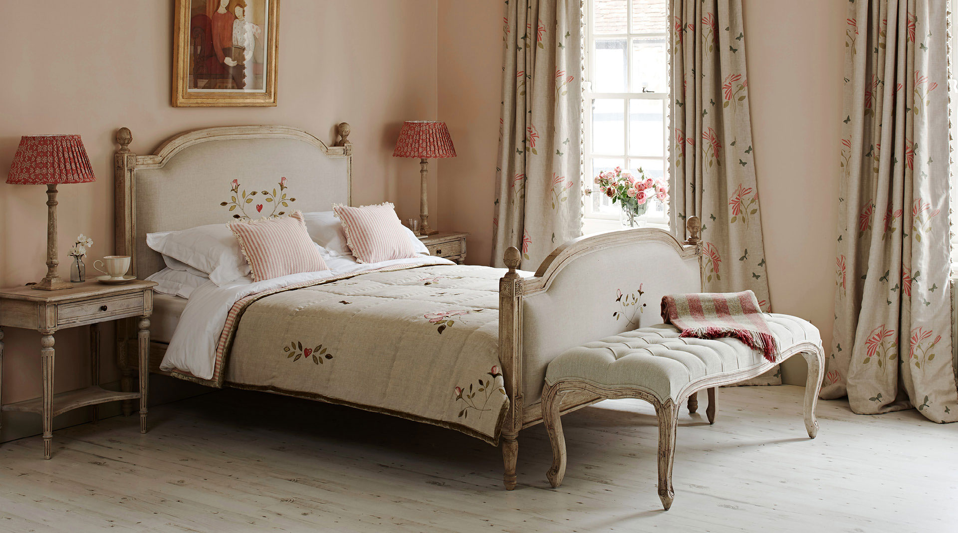
And yet pink has proved remarkably resistant to fickle interior design trends, largely because it works so well as a versatile, neutral shade that softens any space. In softer shades, it has a remarkably calming, restful effect, which is why it is so often the colour of choice for bedrooms. It can work extremely favourably with Dove Greys, for those wanting to tone down its gender-specific associations but act as a muted backdrop to showcase stronger, richer colours. This month we have paired it with pale blue on our applique patterns, specifically our new
Elephant Wedding cushion, to reflect the beginning of Spring!